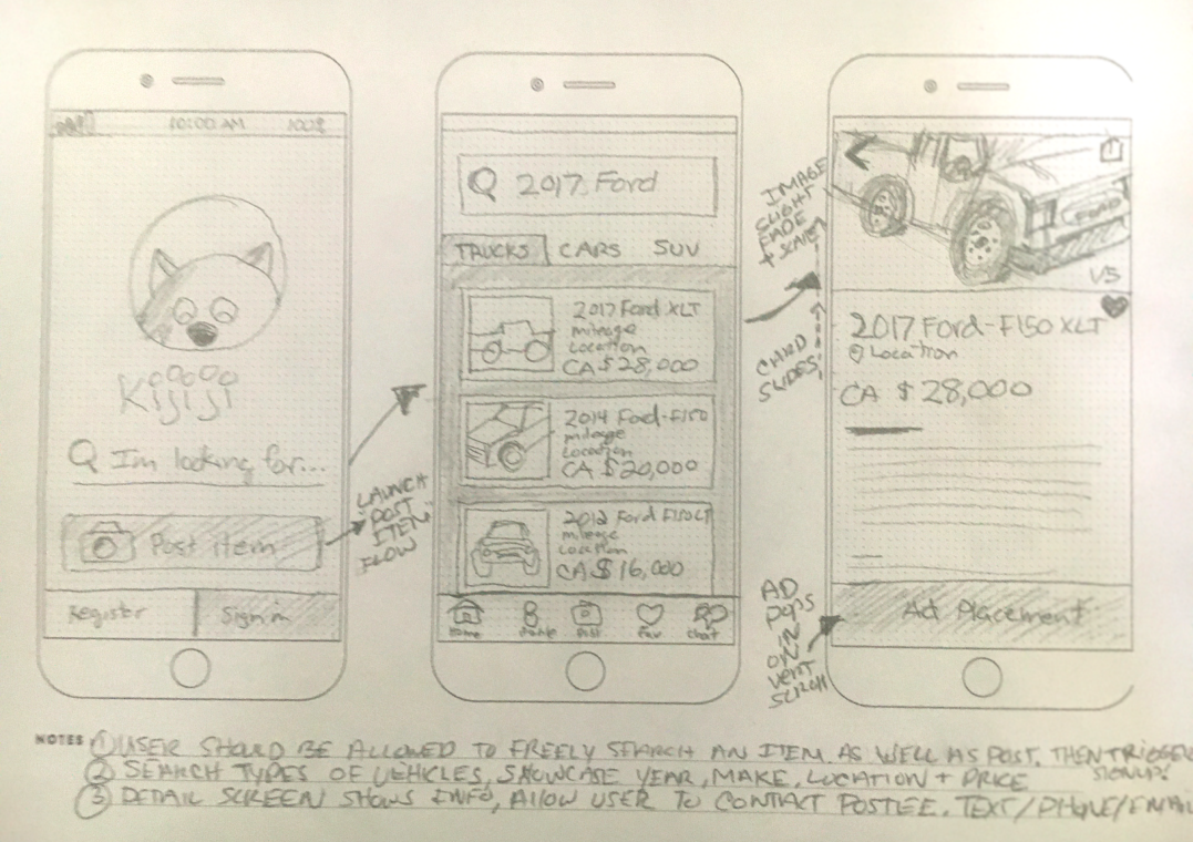
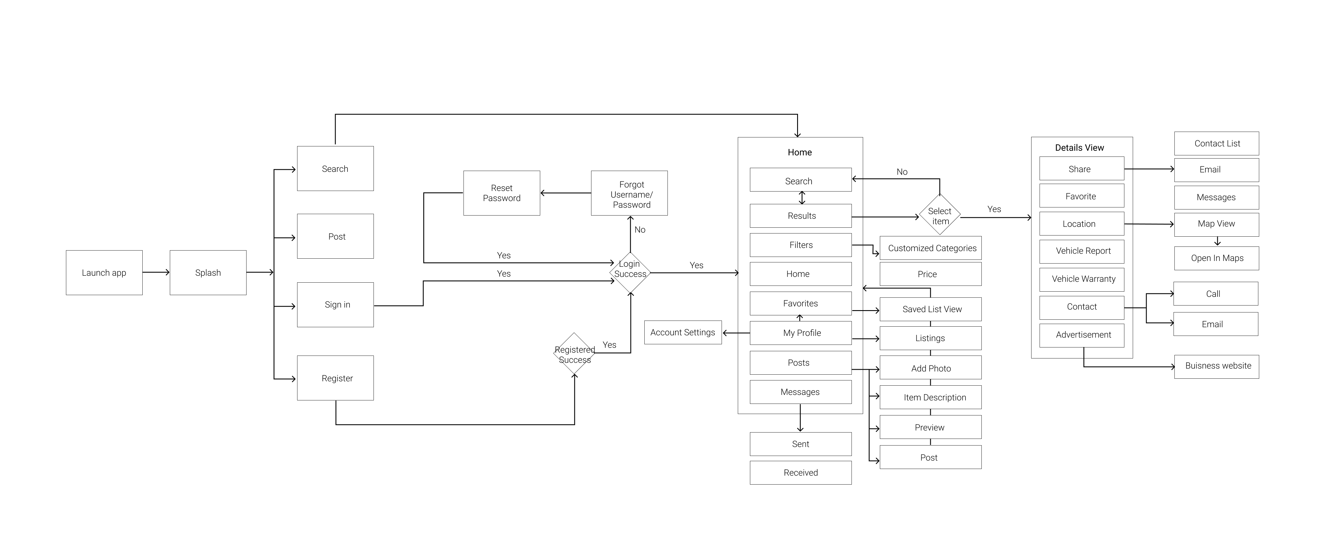
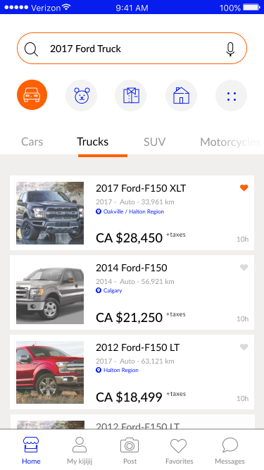
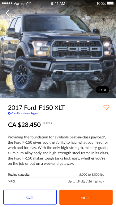
Visual Language & Structure
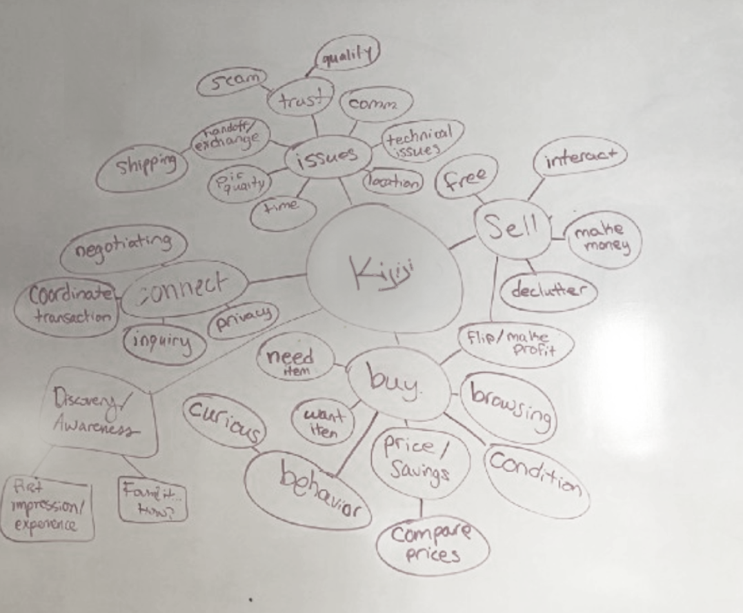
As I started to unpack the potential of this app, my first approach was to do design cluster of ideas to identify all the different types of information, connection points and functionality of the classified app experience. This allowed for a knowledge transfer of all the information that I would need before designing the journey / experience. It allowed for prioritization so we could begin a roadmap for the project and our v1 rollout.
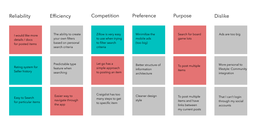
Through interviews of a controlled group I was able to uncover the behavior patterns of how people searched for information, and also uncovered pain points and concerns while using Competitive products.
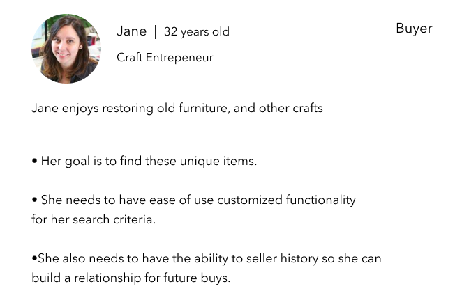
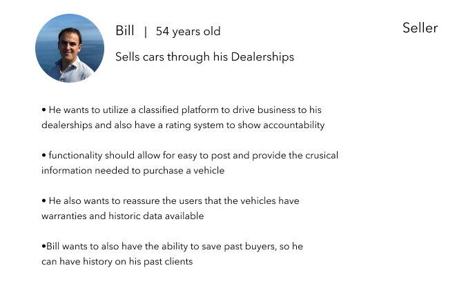
ith all the data insights from user interviews and surveys collected it allowed me to put together an affinity map. Here is where I could see the commonalities and the major takeaways to start building personas.