QuickBooks

Reimagining QuickBooks products brand and functionality

Objective

To update not only the existing products visual language and functionality, but to integrate new features and functionality to the Quickbooks line of products. Redesigning the UX + UI meant that I had to be considerate to existing functionality and slowly do iterations and then share in our high-level discussions with leadership about the cost and impact that some of these updates could potentially have

Outcome

Essentially design a new Quickbooks product from the ground up. Starting with structure of layout and functionality within that structure provided. Getting support from Marketing and sales and making sure we were delivering on our design promise to all our stakeholders. New product features to be intrumented, New visualizations to help communicate the data better, and finally the new Quickbooks brand to create the connective tissue of the product lines.

  • 50%
  • Increase in brand awareness
  • 10-15%
  • New subscriptions from previous year
  • 45-85
  • NPS score
  • 70%

  • Increase in brand awareness
  • 22%

  • New subscriptions from previous year
  • 75

  • NPS score
    Senior Product Design Lead
  • I was tasked with other designers to propose a visual direction along with a systematic approach hence the foundation of the Intuit Design System. This system would have the functionality and scalability across the companies products.
Team
  • Hetal Soni
  • Erika Flowers
  • Nicole Parente-Lopez
Disciplines
  • Senior Design Manager
  • Senior Service Designer
  • Senior Brand Design Manager
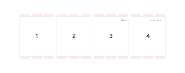
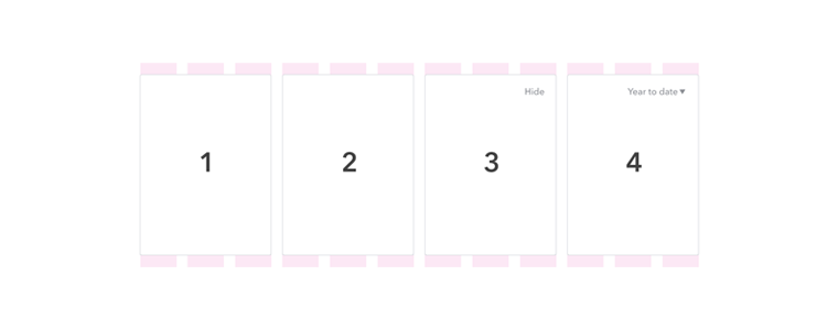
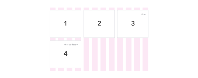
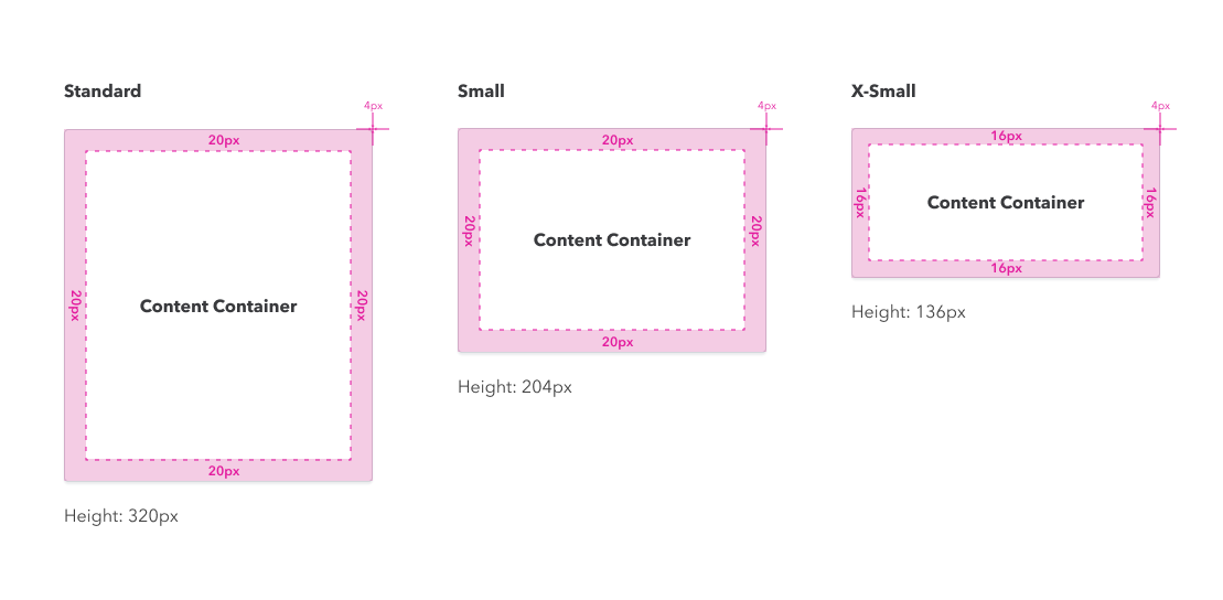
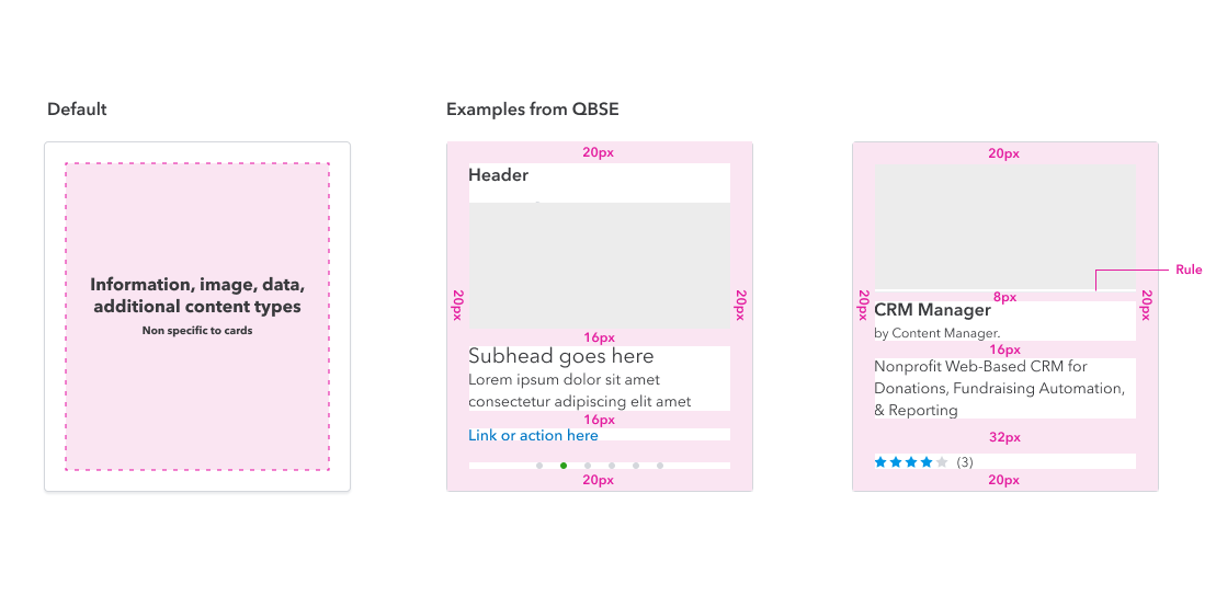
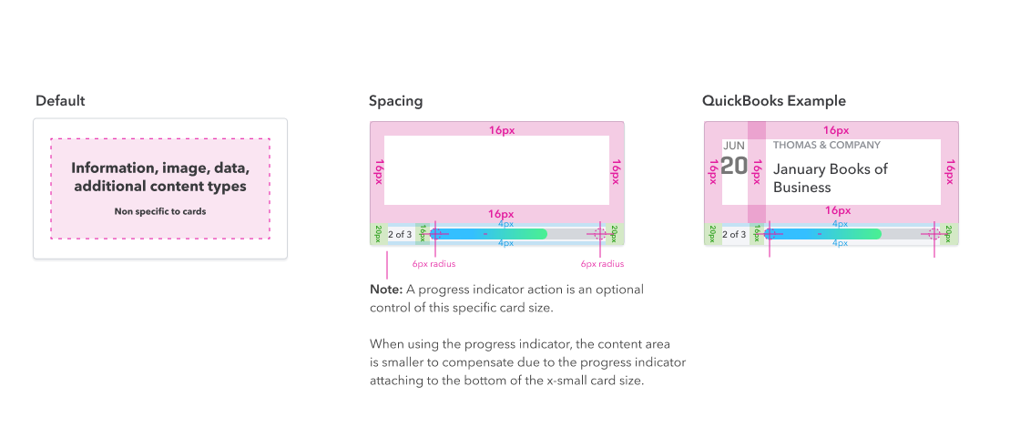
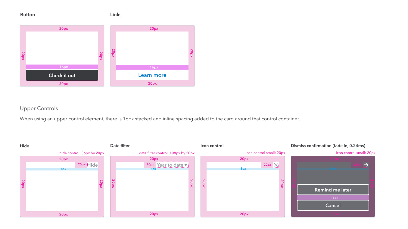
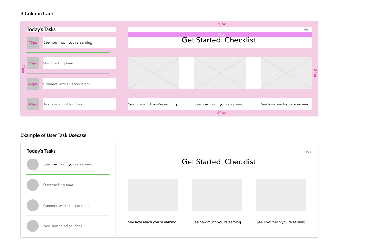
Structure the Dasboard
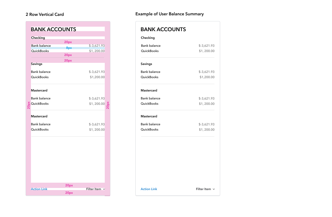
The first step in our process was to redefine the grid and structure for all the new elements / components that were to be built, so they were responsive ready
The team would define the grid as a 12 column grid with a 4 pixel layout grid so every element would be divisible by 4. This would also make the designing and building of responsive components possible and easy to integrate into the system.
Card Space + sizing
Once the grids are set in place the next step in the process is to define the sizes of tha cards- the building blocks and starting point for the product as they would be heavily utilized in the main dashboard view. We did this through annotation of components coupled with rules and requirements. This process started with defining the contextual sizes that would be used for the application.
It was imperative to specify the outside margins of the cards as these margins will change based of the sizing of the cards to keep visual balance and to clearly be able to contain the information within the overall structure of the container wrapper. We also started to define the types of patterns and content that would be displayed / used in the main dashboard view.
Control Variations
The following actions and controls may be added to the card. Things I wanted to consider The entire card can be clickable, and other actions can be included inside the card. As the user moves a cursor to a card, the cursor should change to a pointer.
3 Column Horizontal Card
The 3 Column Card control is used to show tasks and the progress of those tasks. It also can function and be used as a hub for navigate to particular subject matter within the product.
2 Row Vertical Card
The 2 Vertical Card control is used to show your bank accounts and balances or summaries of other financial information.
  • What worked
  • We designed a new structure and foundation that could be rethemed
  • New product allowed rethinking of existing product and it's functionality
  • Increased interest and new users ready to migrate from desktop application to cloud experience
  • Generated organizational interest in continuing to revisit product offereings
  • Communicated the cross-functionality of Qickbooks and other products like TurboTax and how they can work together
  • Quickbooks was looked as an easy to use product with both web and mobile refreshed experiences
  • What needs work
  • Some of the features needed to be fleshed out a bit more
  • Some stakeholders felt their was too much emphasis on the visual design and would not appeal to the fintech space
  • Long term ROI seemed to be a concern - too much time and money put into an already successful product