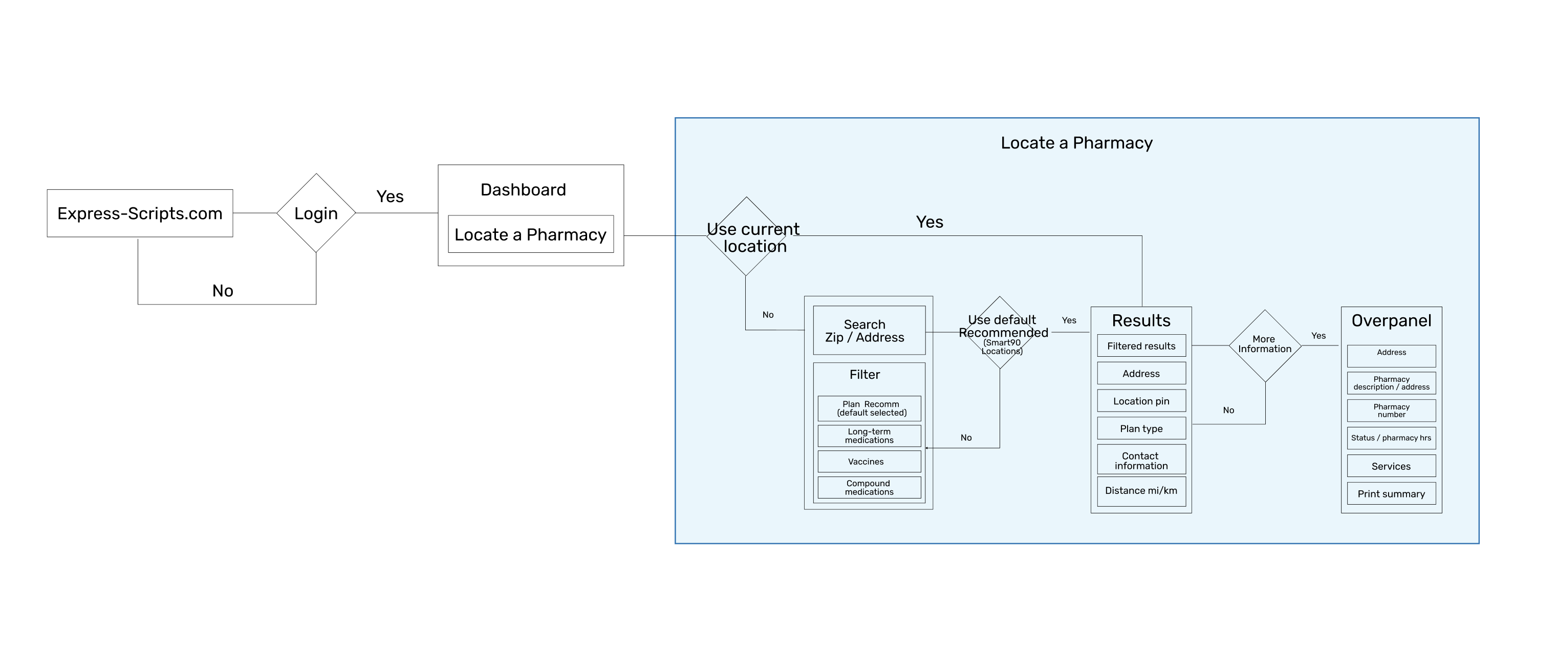
Pharmacy user-flow
As a design team we rallied around the product brief / user story. This allowed us to take all the data / insights provided by the product owners in collaboration with the research team and product manager to define our teams roadmap. This collaboration provided our team structure for our v1 initiative.
Once aligned on our teams scope of work, we could then present to our functional partners / stakeholders so we could get approval on the user experience approach.
Problem solving
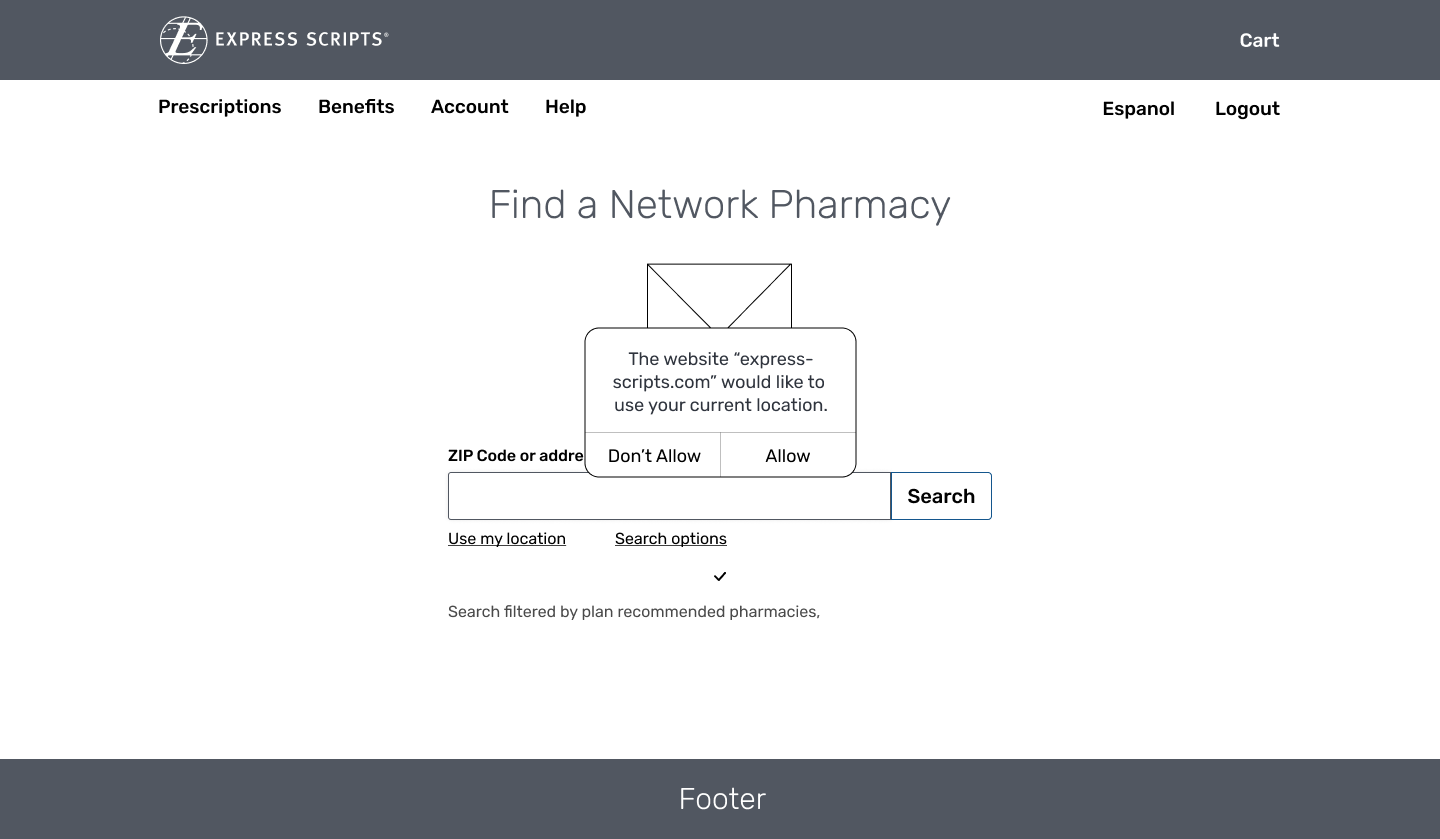
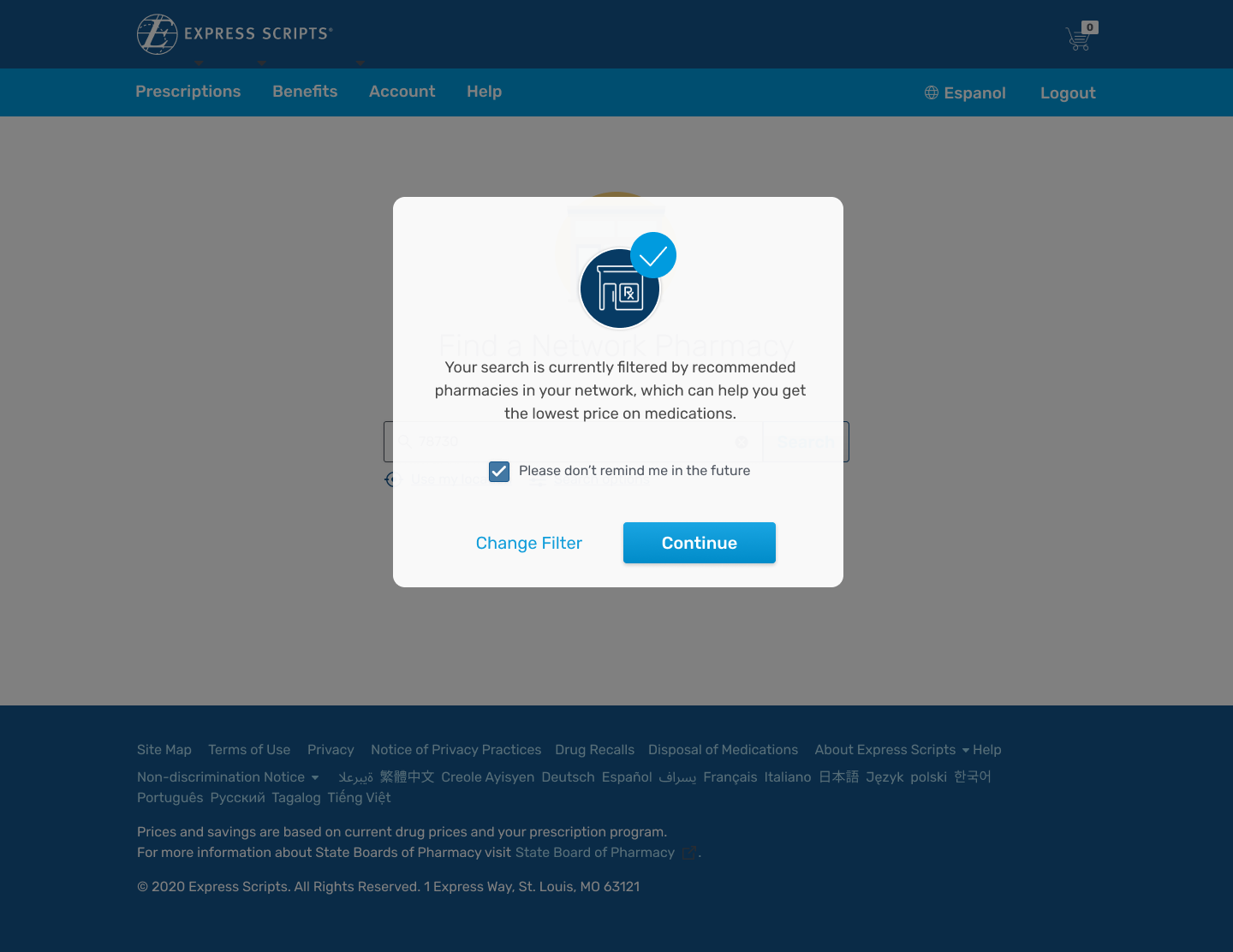
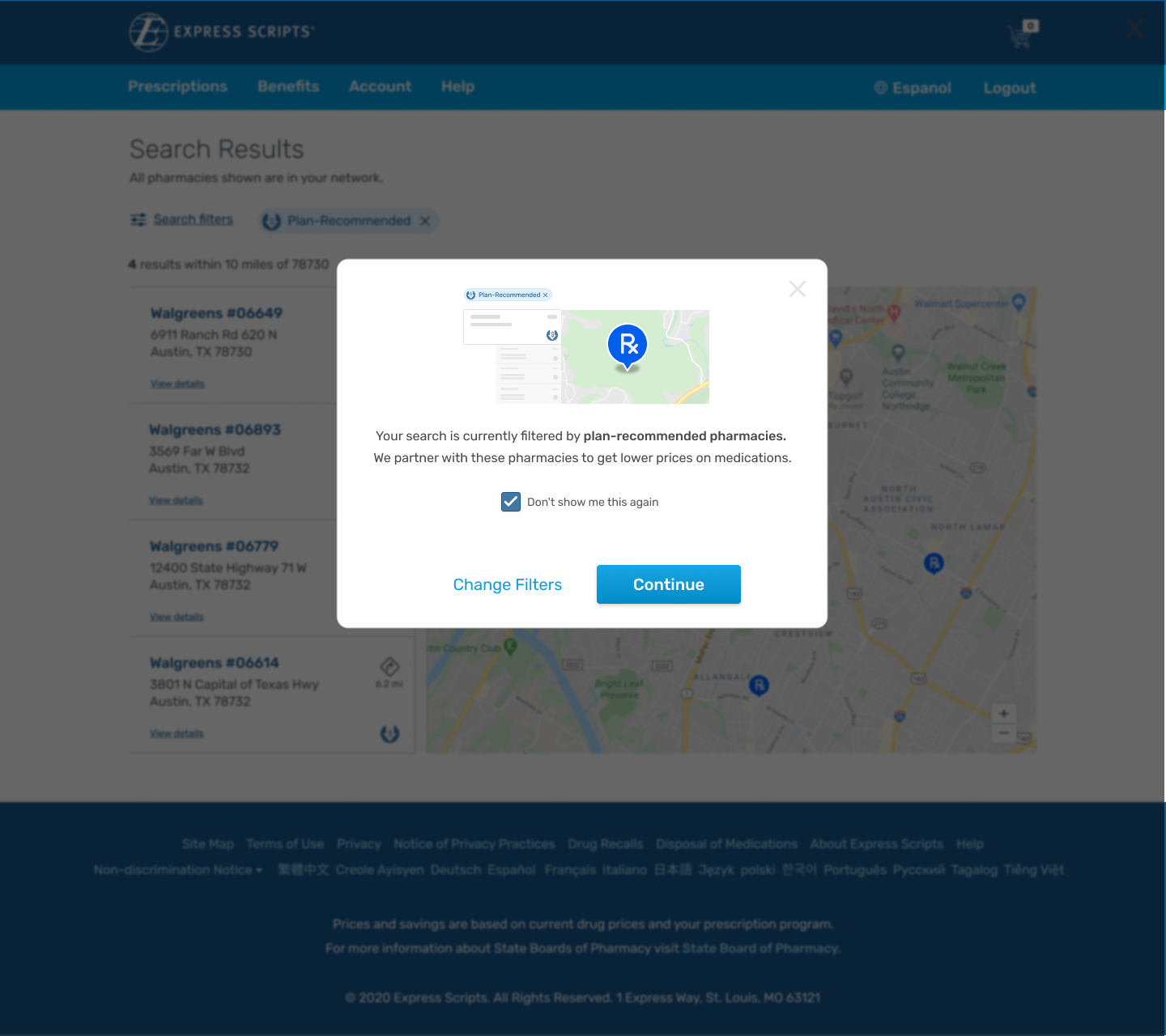
The first problem I felt the experience was lacking was the cloudiness of plan recommended, we din't surface that anywhere, so we started to design rough wires of what that notication vould look like also how much weight it should have before our users begin their search queries.
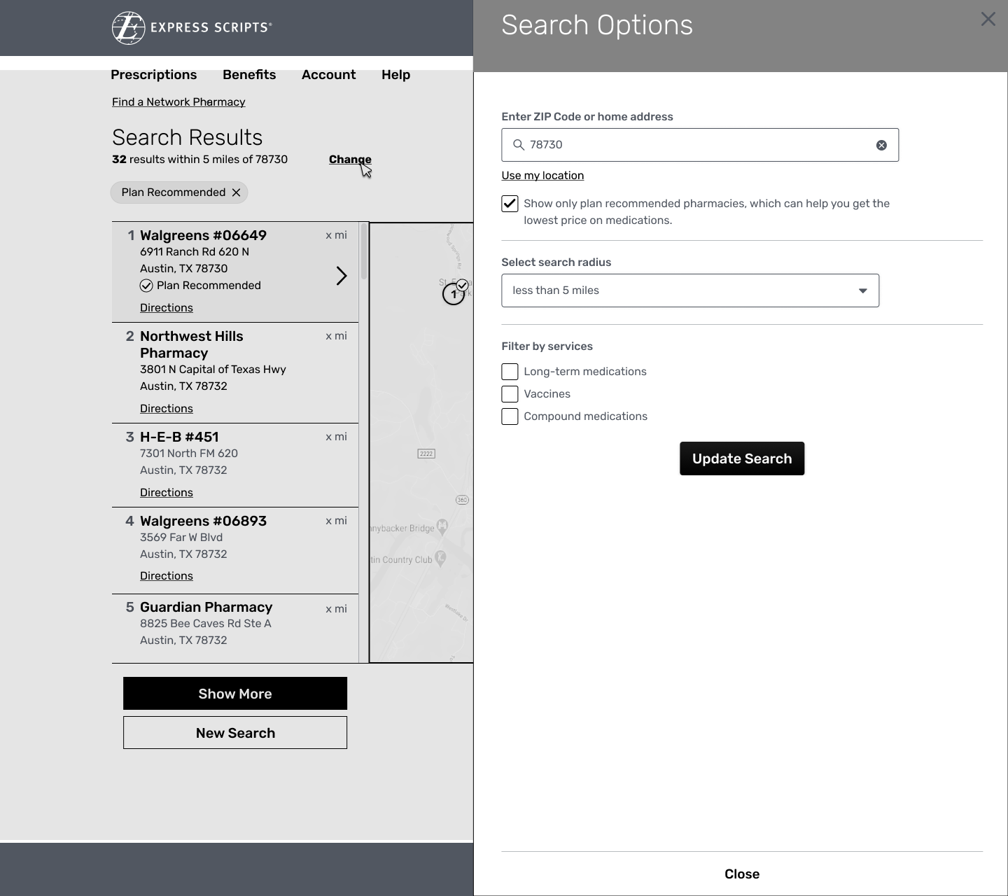
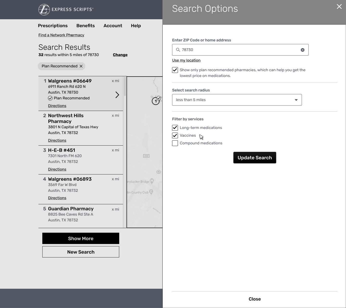
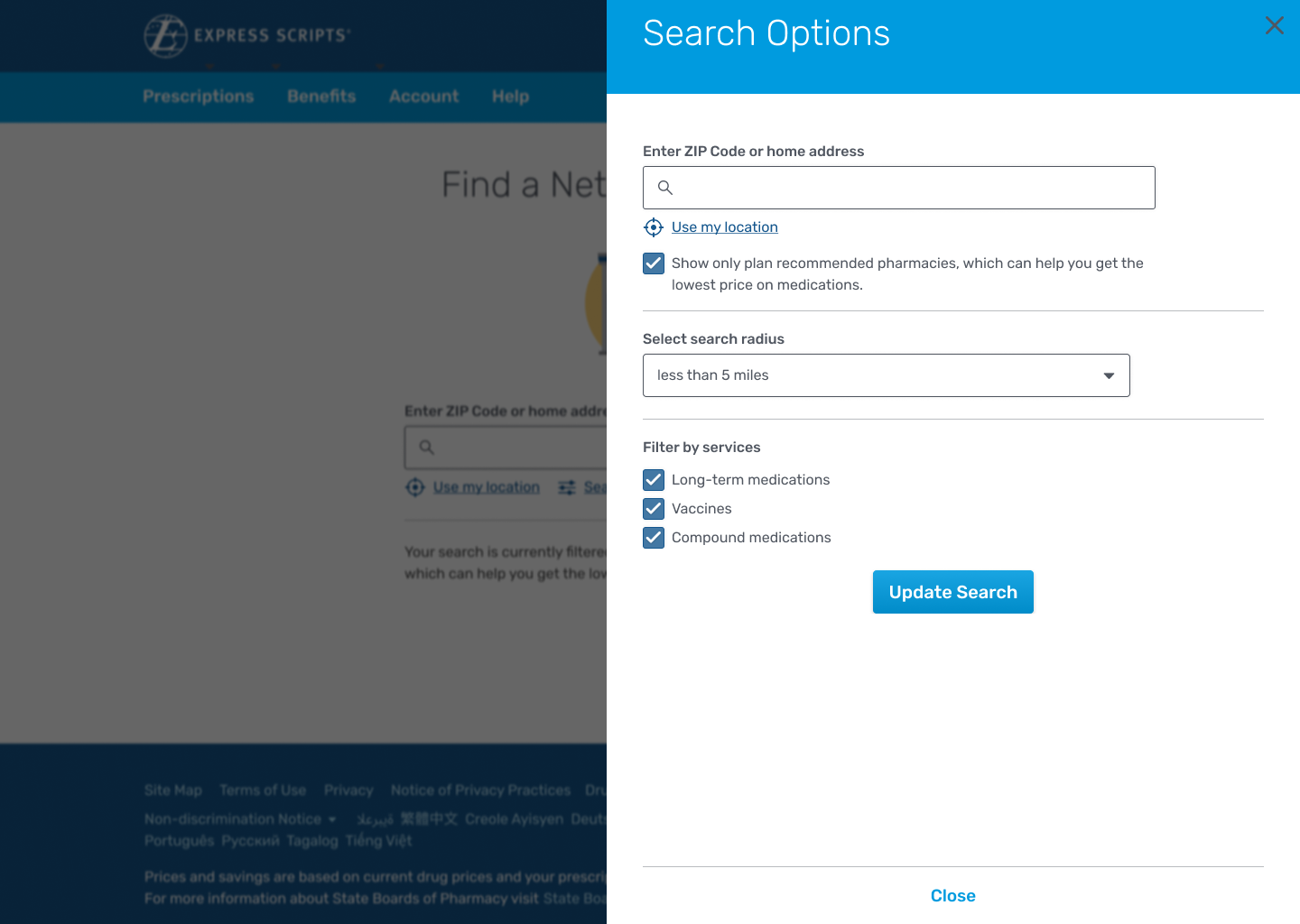
We also needed to give som sort of awarenesss to filters and where they were located so our customers could easily adjust their filtered criteria, giving them the results they set out to receive.
Problem solving
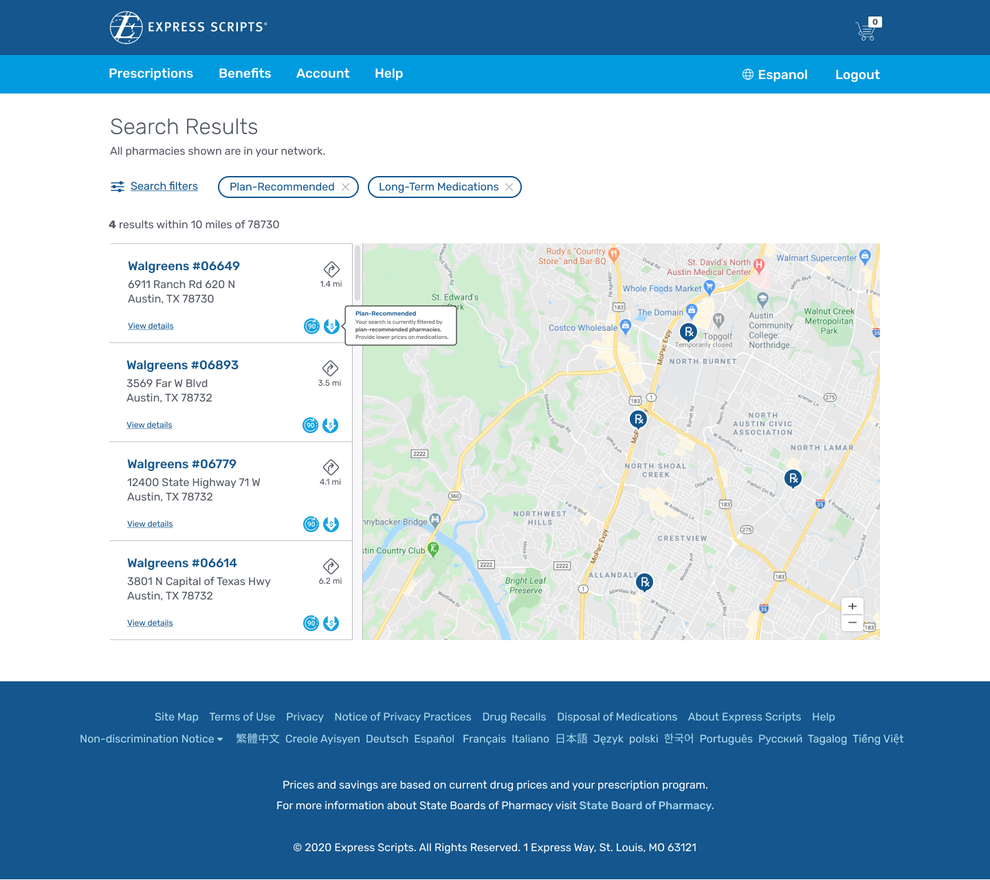
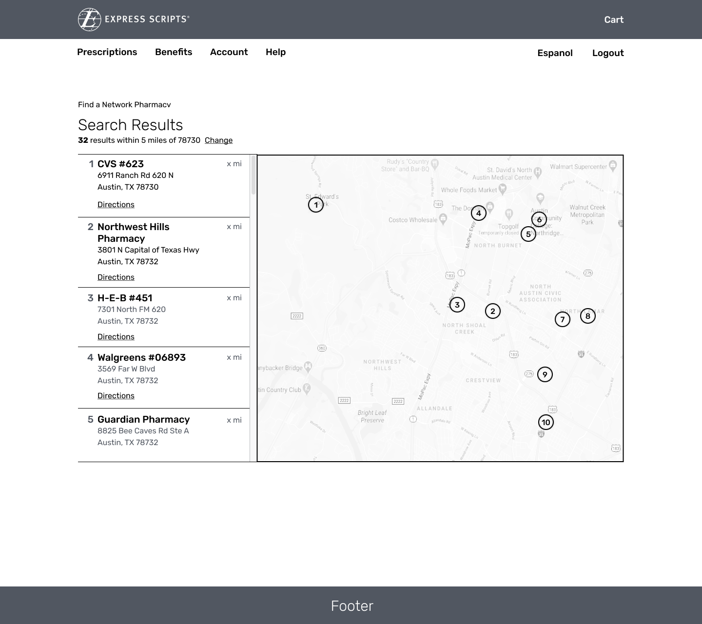
As we explored more of the wireframes we realized that we should have a ranking of returned results that correlated and were contextual to the map.
This allowed users to pan on the map and show even more pharmacies that were recommended in-network (Smart 90 locations) and in-network (covered but not in the Smart-90 Network)
High Fidelity Designs
Once the wires were in a good place, we started the design process and found that plan recommended mention on the home page was not abrupt enough that user testing showed no one was reading, so we opted to make more of a disruptive approach to slow the users done.
I also worked with our content designer on the team to make the prompt more clear and then we performed an A/B test with a small panel of users.
our results on the newer message and surfacing the prompt on the results page favored my design hypothesis. The test showed users pause and read the prompt, not just dismiss it and they knew exactly what their results were going to be because of a clearer message.
Filters
I took the idea of the filters and pushed it a further by implementing an iconography representation that correlated with specialty filters. This would serve added purpose, the first being the representation of specialties as a reminder on the tile results and as a representation for the pharmacy summary to let the user know that the following specialties were available at the selected pharmacy. Last, I added a tile pattern to the specialty checkbox filters. This gave a visual call to action and supported accesibility best practices if a user were to tab into the list of specialty filters.
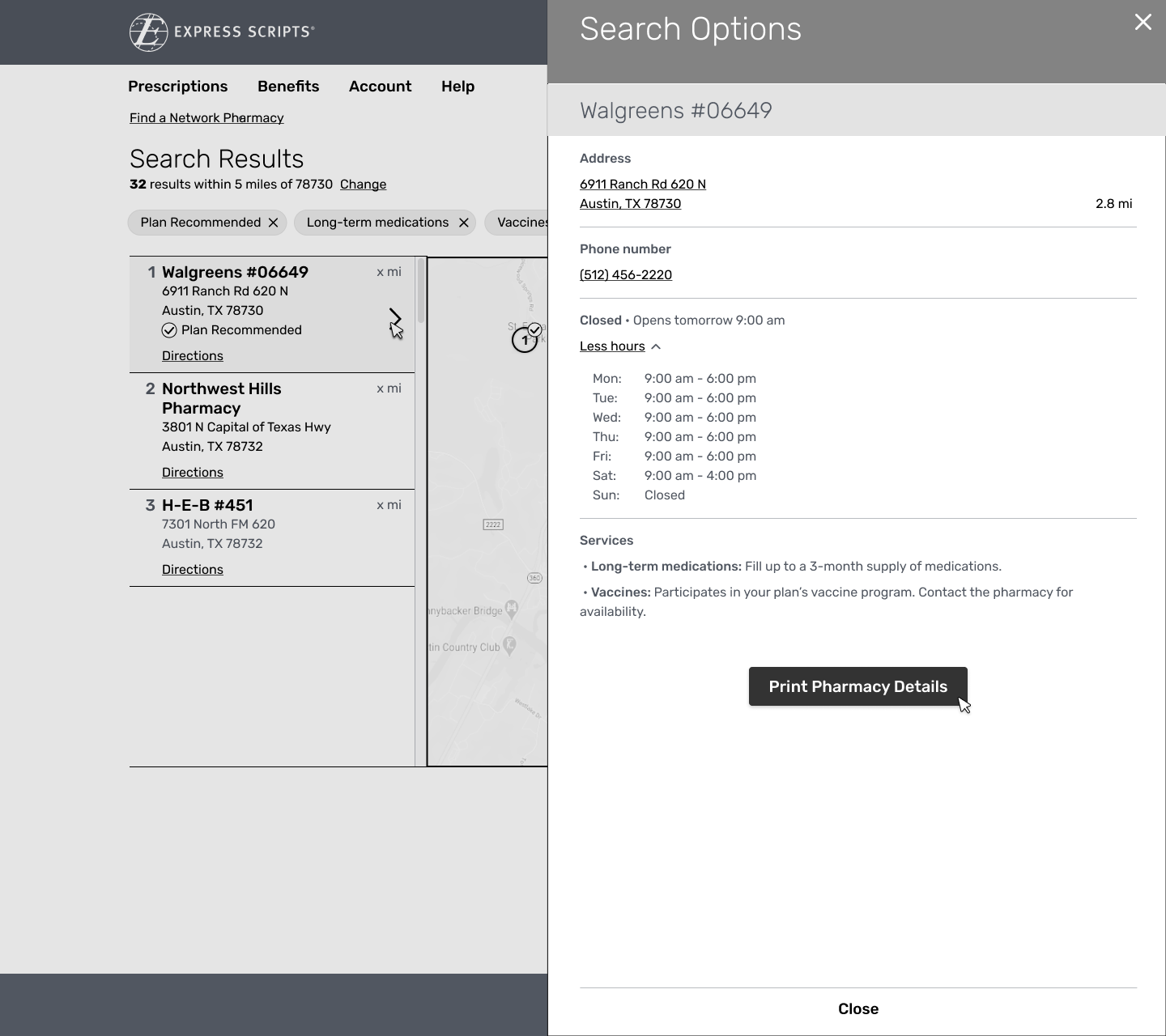
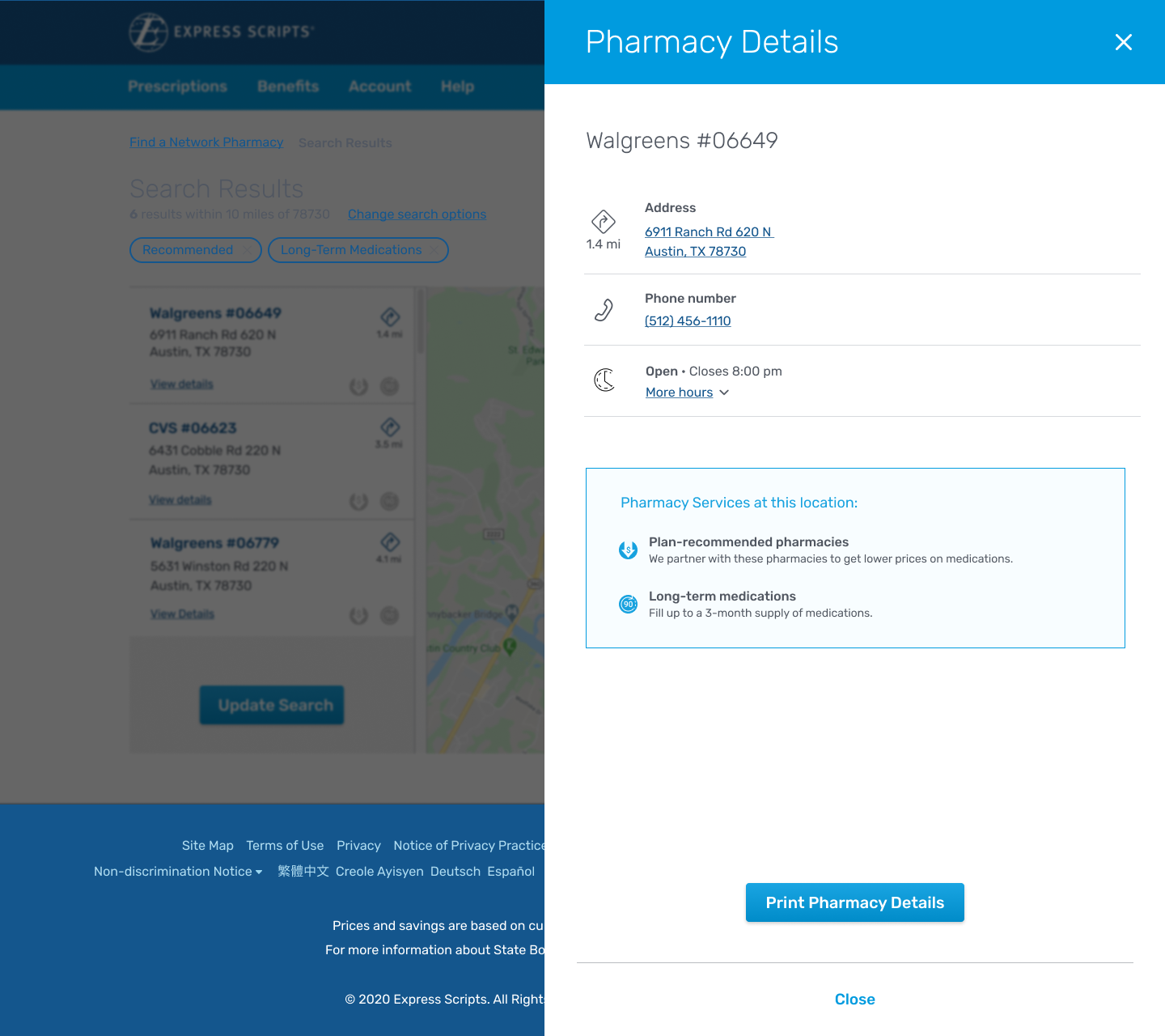
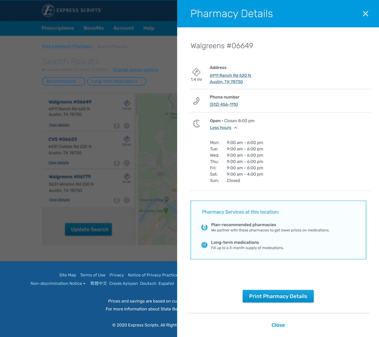
The pharmacy summary was an overview including the pharmacy store number and name for reference. It included directions for convenience (later implementation of gps and directions to enhance web /mobile experience) It also would include contact information and pharmacy store hours of business.
Final Results Page
The results page creates the connective tissue and ties the filters and related icons along with the filter tags to the user and their returned results.
I designed a tooltip pattern as well to give the user an easy reminder of what the icon means and to help building muscle memory for future use. The result tiles containe the specialty icons and the distance of the pharmacy from the users current location along with the pharmacies address.