Evernorth Control Center

One universal space to access mulitple product data insights

Objective

Design a Health Services hub that brings multiple tools and products into one location. A platform that actos as a standalone product with unlockable tools and features but also asks as a tool to surface and highlight News, Articles, content and Events. This platform should not only be an aggregator of informationdm, data and insights but also as a marketing tool for Evernorth brand awareness as a Health Services industry leader.

Outcome

Design an experience that is seemless and ties multiple product offereings and awareness to Evernorth / Cigna customers. This product should be innovative and be useful tool for sales and marketing and our clients. The solution should be scalable and mobile friendly with an intuitive and innovative UI, different from other health service providers that act in a similar space and function.

  • 20%
  • 541,000 - 650,000 logins during first 4 month period
  • 20%
  • 10,000 - 14,000+ increase active users
  • 10%
  • Increase in member tools requested / downloaded
  • 20%+

  • 541,000 - 650,000 logins during first 4 month period
  • 40%

  • 10,000 - 14,000+ increase active users
  • 20%

  • Increase in member tools requested / downloaded
    Manager Product Designer
  • Evernorth Health Services had a business need for a product called Control Center that consisted of two functionalities. The first being a Marketing opportunity to share industry news, and the Second was to have a portal based application that allowed clients to the ability to access data, reports and othe valuable insights in one location. This was also a way for them to stitch the different services to have a common thread and to present a more cohesive experience.
Team
  • Adrian Mucho
  • Jacki Giambrone
Disciplines
  • Junior Product Designer
  • Product Owner
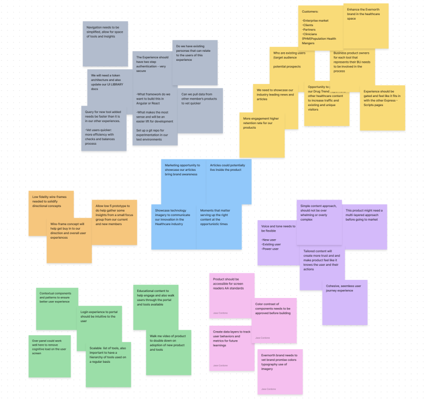
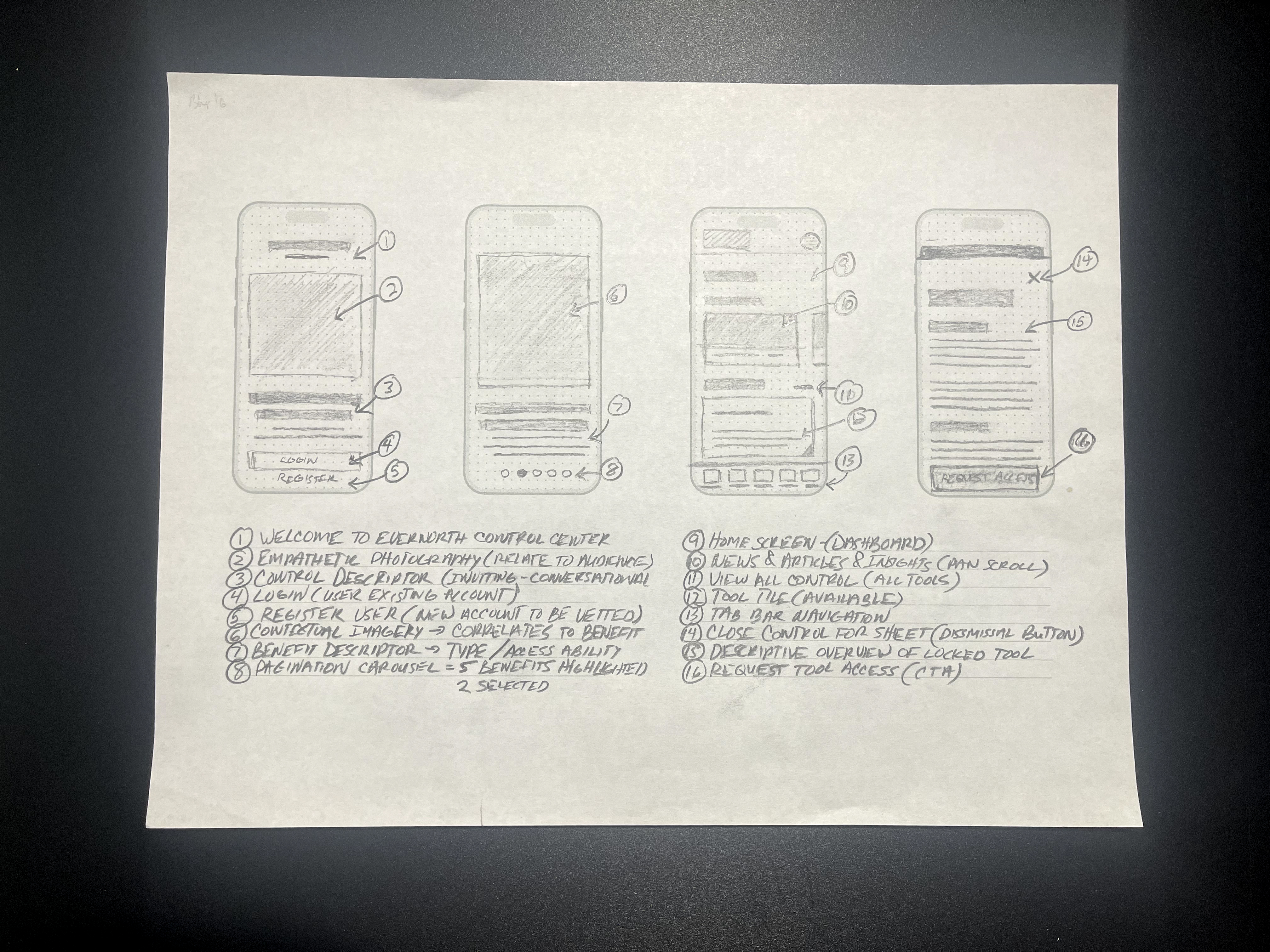
Design Workshop Sessions
As the Design Manager I set up a series of working sessions with our team and the product owners, business stakeholders, research, engineers and our design manager. This was an opportunity for the teams to begin the conversations around this product and features needed to define our success model. oUr approach as a team was to involve as many stakeholders in the process so we were all on the same page at the onset of the project.
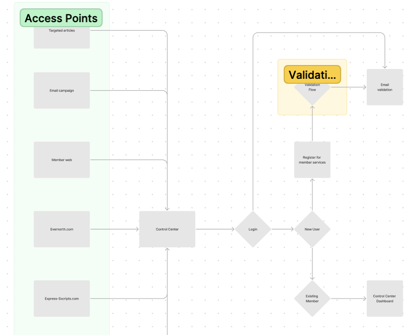
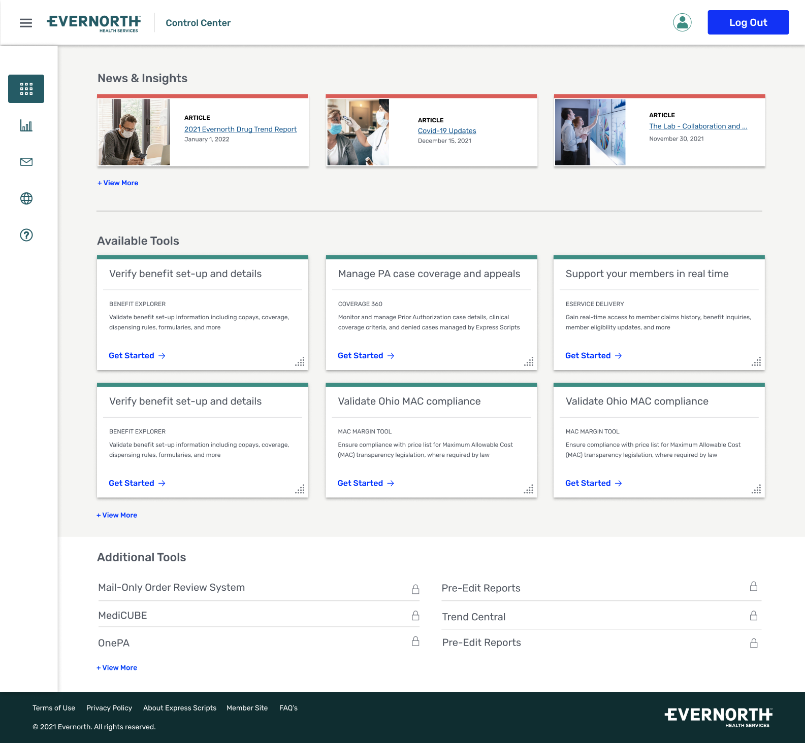
We collectively put pen to paper and explored many different ideas and concepts that the Evernorth Control Center could provide. Keywords like universal and innovative came up alot. The concensus was this was an opportunity to connect product offerings together and also educate and inform our users of new tools, services and capabilities.
Define user journeys
Next step in the process was to map a user journey of all the pages need for the platform. Touchpoints like login, news, articles and rich media would also need to be considered from marketings request in supporting the new Evernorth brand. Control Center would provide variouss tools and services including unlockable tools via user requests and validation.
Once touchpoints were clear, and stakeholders agreed to the flow and design strategy / approach to solving the problem, rough sketches of the application began to help the team get motivated and to ideate the vision that we were proposing based-on past user-feedback and business stakeholder insights that were gathered.
cisco wireframe
Sketching out the web application
The initial rough sketches of the structure and layout for Control Center started and it allowed an opportunity to bring all these ideas together. I knew that cards would be the ideal pattern for this user experience, as they would act as portals to other application experiences that users could access via Control Center Home / Dashboard screen.
Sketches are always my approach to designing an experience as it removes the distractions that high fidelity or even wireframes provide. This allows the design to evolve and gives the flexibility of going broad before narrowing in on a couple of directions.
Narrowing in on a design direction
Once the sketches are in a good place and notations / callouts are recorded, the design then moves into the wireframing phase. This part of the process is where the vision starts to become something a bit more tangible. It allows stakeholders to absorb the proposed direction.
I also created a prototype to click through, this allows stakeholders to consiume the interactions / functions along with how the application flows. I prefer this approach as it removes friction during the proposal presentation - it's more precise.
Team work makes the dream work
Worked through a tight timeline for the launch of Control Center because of partnership dependencies and worked closely to accommodate their schedules / roadmap. It was important as the lead to make sure that wireframe designs were explored thoroughly and approved. Next was to collaborate with the Evernorth brand team to make sure that color palette, typography, voice and tone aligned with our brand promise. Also connected with engineering to approve the structural direction and the functionality was feasible given our UI component library. Working with these cross-functioning teams allows for everyone to be included in the conversation-removes the silos.
These series of conversations at a high level fed into the ground level work. It allowed for the teams to rething and rebuild existing and upadted components and patterns for our orgs Enterprise Leaf Design System. Design and marketing stakeholders rallied around the designs that I put in place for Control Center, and it inspired other products within our Health Care ecosystem.
Mobile Exploration
As I explored the web application experience, I always was simultaneously thinking about the mobile experience. The idea of simplification with a mobile-first mentality allows to remove the added noise for any experience. I started with rough sketches to formulate the behaviors.
When thinking about mobile there was some more elements and interactions that needed to be onsidered. Understanding mobile foundations and component libraries / functionality is essential to delivering an intuitive experience. This also gave th eopportunity to decide on how to make a cohesive experience between the web application and the mobile experience.
Mobile high fidelity designs
Sketches were finalized and so I started to design the mobile experience ui components / visuals. Agin worked closely with my brand and engineering cross-functional partners to get approval on brand and UI components
I pushed the visuals and simplified navigation using simplified tab bar, sheet patterns, scrollable tiles levergaing progressive disclosure to utilize the core benefits of the user experince on mobile.
  • What worked
  • The vision of Control Center was scaled tremendously
  • We collaboratively delivered a delightful product experience
  • Development teams were very fast at interrating in real-time on the product
  • Time saved not having to iterate designs the business knew what they needed vs wanted
  • Simplified web application evolved into a even simpler mobile application
  • What needs work
  • More features are needed to truly match this product to scale
  • Lack of funding because of other initiatives within the organization
  • Control Center team was slowed down by other products (tool features) not being ready to go to market